Symbols

Board of Peace: gold and only America in the logo of Trump's new order

The symbol of the new international organisation looks like a Trump-style reinterpretation of that of the UN. For the US, world peace comes through strength

by Massimo De Laurentiis

 (AP Photo/Evan Vucci)

3' min read

Translated by AI
Versione italiana

3' min read

Translated by AI
Versione italiana

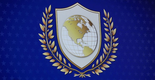
Looking at the logo of the Board of Peace, the international organisation created and promoted by US President Donald Trump, two elements immediately jump out at you: the preponderance of gold and a map of the world that includes only America. As is often the case, the symbols say a lot.

The logo elements

The graphic identity of the Board of Peace, which the US administration presented to the world at the World Economic Forum in Davos in January, is reminiscent of a heraldic coat of arms. In the centre is a shield, to be precise a Swiss shield, framed by what appear to be two olive or lawn branches, a symbol of glory.

Loading...

But the most unusual feature concerns the globe set into the shield in the centre of the logo: a representation of the world in which, however, only North America is included, with part of Latin America. The rest of the planet, four continents and at least 160 internationally recognised countries, is not considered.

Everything is immersed in gold, a decorative element particularly dear to the American president.

The confrontation with the UN

As the British newspaper The Guardian wrote, the symbol seems to be a Trump-style reinterpretation of the UN symbol, which in the tycoon's intentions could play a marginal role with the advent of the Board of Peace.

The parallelism with the UN allows us to see how the symbolism is reflected in the role and objectives of the two organisations. As stated in the official website, the emblem of the United Nations was conceived as "a map of the world representing an equidistant azimuthal projection centred on the North Pole", so as to include all countries without letting any particular perspective prevail.

Surrounding the globe thus depicted are two olive branches, a symbol of peace. The final key element of UN iconography is the "UN Blue", a light, neutral shade of blue that contrasts with red, which is associated with war.

The Trump aesthetic

The international initiative born at Trump's instigation reflects a symbolic ideal of authority and power that the US administration holds dear.

In August 2025, the White House issued an executive order called 'Making Federal Architecture Beautiful Again', which contains new style guidelines for federal buildings. As the order states, the preferred style is classical, which 'elevates and beautifies public spaces, inspires the human spirit, ennobles the United States, and commands respect from the people'.

Moreover, the president himself made several modifications to the White House, with the use of fine marble and, once again, gold decorations. In an interview with Fox News last year, Trump proudly shows off the renovated areas and illustrates the plan for the imposing ballroom, capable of seating a thousand people, which is to be built in the east wing of the White House.

The debut of the Board of Peace

The first meeting of the Board of Peace was held in Washington on 19 February. It is only by invitation, one has to pay a fee of at least a billion dollars to become a permanent member, and the presidency is entrusted to Donald J. Trump for life, apparently irrespective of his institutional mandate in the United States.

The declared objective is to overcome the inefficiencies of the UN to achieve peace in the world, that 'peace through strength' that is one of the mantras of the American administration. A strength that this new international body wants to convey beginning with symbols.

Copyright reserved ©
Loading...

Brand connect

Loading...

Newsletter

Notizie e approfondimenti sugli avvenimenti politici, economici e finanziari.

Iscriviti