Fine jewellery

In the heart of Kupa-Piti, between the opal mines and the skyscrapers of Melbourne

An iridescent stone that seems to capture the blinding light of the Outback. An exhibition at the National Gallery of Victoria, one of Australia’s finest museums. At its heart are four hundred masterpieces featuring sapphires, emeralds, diamonds and the gem with its iridescent hues, a symbol of the country.

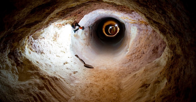
Una miniera di opale a Coober Pedy, nell’Outback australiano. ©Shutterstock / Adwo

6' min read

Translated by AI
Versione italiana

6' min read

Translated by AI
Versione italiana

It is an iridescent and mysterious stone, with flashes of colour spanning the entire spectrum of light. Over 95 per cent of the world’s opal comes from Australia, and of this, 80 per cent comes from a desert region in South Australia, in the heart of the vast Outback. Coober Pedy lies at the centre of this region and is a small, arid and dusty town, built from scratch in the early 20th century to offer miners a semblance of community. The houses were built underground or dug into the sides of the hills because outdoor temperatures could reach unbearable levels. The Aboriginal people called this place Kupa-Piti, which means ‘white men in the pit’. Men who lived underground.

Modernity has brought electricity and air conditioning, so many of those underground dwellings have now been turned into extravagant hotels and museums. The blinding light of this land, however, has remained the same; it is the very light that left the Scottish explorer John McDouall Stuart almost blind on his return from his 1861 expedition to discover the centre of Australia, passing through what is now Coober Pedy. And it is the same light which, reflected off the opal, creates the most unexpected plays of colour.

Loading...

It was once believed that this stone was cursed, and it was rarely used; in reality, it was the jewellers themselves who shunned it because it was fragile and difficult to cut, but today it is prized for its incredible ability to change colour simply by shifting one’s gaze.
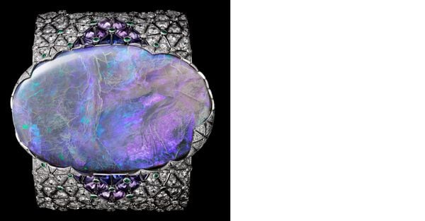
Bracciale in oro bianco e diamanti con un opale da 189,345ct, smeraldi e zaffiri viola e blu, CARTIER COLLECTION (2015).


Perfect examples of this are the two bracelets on display in Melbourne: a slender band designed in 1928, set with diamonds and five black opals – the most valuable of which is actually so named because it has a dark base that allows the crystals to reflect light – and a much more striking bracelet, comprising a band of diamonds, blue and purple sapphires and emeralds, nearly five centimetres wide, with an incredible 189-carat opal at its centre. The coloured gemstones are set all around it, their colours mirroring those reflected by the light. A striking and contemporary masterpiece, designed in 2015 and displayed alongside pieces from very different eras, demonstrating that modern and antique actually work very well together.

When Melbourne’s NGV – the National Gallery of Victoria, regarded as one of Australia’s finest museums – asked Sabine Marcelis to design an exhibition on Cartier jewellery, one of the largest ever organised, her reply came within seconds. For the Dutch artist, renowned for her original and delicate use of light and colour in her art installations and design pieces, this was the project she had been waiting for. Nothing better than coloured gemstones and diamonds to convey light through chrome-plated glass, resins and natural stones – her favourite materials – and, above all, to create a vibe, as she herself explains: an emotion capable of discreetly accompanying visitors throughout the exhibition.

L’area delle miniere di opale a Coober Pedy. ©Getty Images

The entrance to the space is an empty, white corridor, with a long chrome-plated glass panel on one side, which reflects the colours used throughout the eight exhibition rooms: from light green to yellow, from coral to burgundy, with every shade in between.

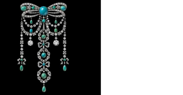
Following last year’s success at the V&A Gallery in London, Cartier has arrived in Australia with 200 additional pieces and many previously unseen jewels, on loan from private collectors living in this part of the world. The Parisian fashion house aims to celebrate 50 years of collaboration with Australia in this way, and does so right from the very first room at the end of the corridor, which is dedicated to the garland style and to a special woman who was also one of its first international clients: Dame Nellie Melba. The opera singer was born in Melbourne in the second half of the nineteenth century – hence her stage name, Melba – and had reached the height of her success in Europe before returning to Australia to teach at the Melbourne Conservatorium. Her passion for turquoise is on display in a showcase, entirely dedicated to her, featuring a tiara that can be transformed into a choker and represents one of the first reversible pieces designed by Cartier – practical and functional – for a woman who performed all over the world and wished to wear her jewellery both on stage and off.

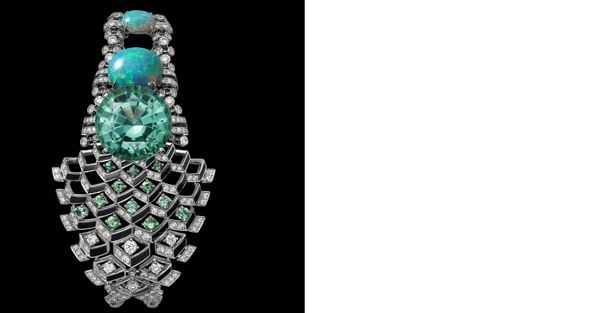
Bracciale, 2018, CARTIER COLLECTION.

Nellie Melba was also very fond of opals in her jewellery, and a small display case dedicated to this distinctive stone can be found in the An Obsession with Stones section, where the dominant colour is dark red fading into burgundy.

Opal simply had to feature in this edition of the exhibition, as it is Australia’s national gemstone and perhaps captures the country’s light better than many other gemstones.

Loading...

Looking at it, one naturally wonders just how heavy the diamond bracelet with that incredible opal at its centre might be, and how such beauty and practicality can coexist. ‘Actually, it’s lighter than you might imagine,’ reassures me Pierre Rainero, Cartier’s director of image, style and heritage. ‘But lightness isn’t always a virtue – quite the opposite, in fact. There has to be some weight; you have to physically feel the jewellery on your body. We have clients who specifically ask for jewellery of a certain weight because they want to feel it and move with it. Wearing jewellery can also be a form of play, and there must be a deep physical connection with it.”

Spilla da corpetto, 1902, Private Collection, CARTIER PARIS.

This is clearly illustrated by the pieces designed in the 1970s for the Mexican actress María Félix, on display in the green room dedicated to actresses and princesses. María Félix loved eye-catching, very heavy jewellery, featuring dangerous animals such as alligators and snakes, which could also be used as sculptures in the home when not being worn.

Amidst the very different – and at times even contrasting – styles of María Félix and Grace Kelly, Elizabeth Taylor and Princess Margaret, the unique style of Wallis Simpson stands out, the Duchess of Windsor, who was enamoured of the panthers designed by Jeanne Toussaint, Cartier’s creative director for almost forty years. Toussaint chose this wild animal to symbolise a modern and elegant woman – independent and self-assured – of whom both she and Simpson were undisputed role models at the time.

White with very light grey, almost silvery, undertones is the colour of the space dedicated to watches and the sketches produced even before the jewellery; it is a clean colour that inspires precision and simplicity, just like wristwatches – Cartier was the first to move the time from the waistcoat pocket to the wrist – and, above all, just like the famous mystery clocks, table clocks with a transparent dial and a mechanism perfectly concealed within what is also a small sculpture.

Collier Coccodrilli (1975), CARTIER COLLECTION.

Yellow, on the other hand, is the colour chosen by Sabine Marcelis for the section that explores the influences the fashion house has drawn from all over the world, thanks to the passion for travel that the three brothers – Louis, Pierre and Jacques – harnessed to enrich and expand the business. China, Russia, Egypt, Iran, Japan and India, with their distinct styles blending together to create a unique aesthetic.

“Other cultures are deeply ingrained in this fashion house’s creative history,” explains Pierre Rainero. “They are an integral part of its style and of a language that is constantly evolving.” Proportions, balance, the simplicity of forms and even colour combinations – often unexpected and very modern – are the result of these encounters with the world, and are expressed in a final concept of beauty that has no rules or parameters. “Beauty exists when there is a particular emotion – one that cannot be measured or explained – which creates an immediate connection with something beyond ourselves,” continues Rainero. And beauty compels us to pause, makes us hold our breath, and urges us to gaze at it in silence.

After a dark grey section showcasing the more contemporary pieces – including Aldo Cipullo’s ‘Love’ necklaces and bracelets, and a selection of jewellery designed after the year 2000 – we approach the end of this long and precious journey.

The final room is circular and clad in a deep, rich red; it is dimly lit and features a large velvet seat in the centre, illuminated by a circular opening in the ceiling. This room is dedicated to tiaras – those jewels that symbolise nobility and power, which very few people in the world can afford to wear. Twenty-four are on display, each with its own fascinating story, crafted from diamonds and platinum, featuring precious stones and styles ranging from garland to Art Deco, from classic to contemporary. It is the grand finale, where time stands still: the light here is solely that reflected by the diamonds and platinum, with just a few precise colours interrupting and altering its flow, playing with it before returning to the starting point.

It is light, in fact, that shapes this exhibition. That defines the forms. That interprets the colours. And that evokes emotions.


Copyright reserved ©
Loading...
Loading...

Newsletter

Notizie e approfondimenti sugli avvenimenti politici, economici e finanziari.

Iscriviti