Il Sole 24 ORE Group, new name and logos between history and the future
Two brands for the transition from Gruppo 24 Ore to Gruppo Il Sole 24 Ore: conveying authority and competence of the entire system
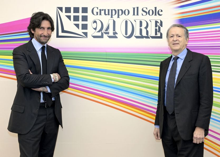
by R.I.T.
A return to the roots, to the Group's history, and its projection into the future. This is the philosophy behind the rewriting of the Il Sole 24 Ore Group's brand identity, which chooses identity as a lever for evolution. A new name, a new logo: a message that affirms the depth of the Group's 161 years of history and wealth, projecting it into a new vision of the future.
Italy's leading publishing group in economic, financial, regulatory and cultural information opens a new phase by announcing a renewed brand identity, based on clear, symbolic and strongly recognisable identity choices.
At the heart of this evolution is, first and foremost, the change in naming from Gruppo 24 ORE to Gruppo Il Sole 24 ORE. An act of valorisation of the informative, cultural and civil heritage that for over 160 years has represented a point of reference for the entire country. Because Il Sole is not only a historical legacy, but a living resource, capable of driving innovation by guaranteeing consistency, credibility and authority.
This choice is accompanied by a new visual brand, capable of interpreting in a single logo all the assetsthat constitute its value: the only multimedia platform in Italy that not only includes, but also integrates daily newspapers, digital, news agency, radio, television, books, podcasts, professional publishing, training, exhibitions and events, together with initiatives and services for professionals, companies, business communities and institutions.
"Guiding us along this path towards designing our future was a fundamental principle: the need to represent, in an authentic and contemporary way, the identity and essence of our ecosystem," explains Il Sole 24 ORE Group CEO Federico Silvestri. "This is why we have decided to retrace our history and "make a square" in the link with our tradition, our culture, our values, our people. A symbolic square that becomes a brand and takes on body and three-dimensionality: a symbol of constant development in the continuity of authority, and that today reveals a composite heart that projects us into the future. Because designing a new identity means reaffirming who we are in the present and directing the future. It is therefore our heritage that guides our evolution'.