Saros, the violent beauty of Housemarque: art, difficulty and vision beyond the Ai
Art director Simone Silvestri talks about how the Playstation video game aesthetic was born and reflects on the (rejected) role of artificial intelligence in the creative process.
by Luca Tremolada
Saros is first and foremost a place. In the PlayStation-exclusive video game, released on 30 April, players take on the role of Arjun Devraj, an enforcer exploring the planet Carcosa, an alien world perpetually transformed by a solar eclipse that alters its morphology and dangers.
Finnish studio Housemarque - now an integral part of PlayStation after the success of Returnal - decided to evolve their game idea towards a more ambitious narrative structure and a more layered progression system. Unlike its predecessor, the title introduces progression mechanics that allow you to upgrade your equipment permanently, mitigating the punishing nature of classic roguelike games to embrace an experience closer to contemporary big action-adventure.

For being difficult, it remains very difficult, but compared to Returnal it is aesthetically more beautiful and more forgiving. The writer played about ten hours of Saros, died very often, but the frustration was offset by the artistic beauty of the setting, the ease of the arcade gameplay, where you jump, shoot and dance through bullets as in few games in the world, and a story punctuated by eclipses that is revealed one piece at a time.
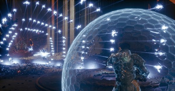
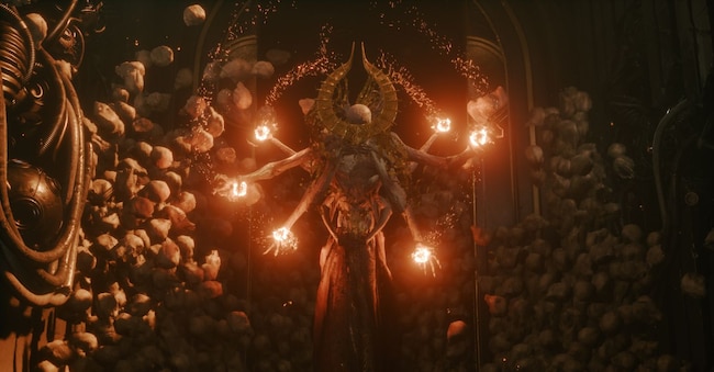
"When I joined the project," Simone Silvestri, art director of Saros, told Il Sole 24 Ore, "I spoke with creative director Gregory Louden: he showed me the eclipse and said that this is the central force that drives the mystery of the planet. It was a very easy anchor for me: I said 'OK, we will anchor the art to this element. It has to be the centre that drives the whole engine of the game. We are telling a story about greed and power, and what we are trying to say is that there is corruption, and in corruption there is power. When you activate the eclipse, you see these yellow bullets full of corruption that you can use to get more power, but you have to be careful because they corrupt you too. We have an atmosphere we call 'luminous violence' because the bullets have an arcade neon glow and we wanted to make sure we had that as a thread in the narrative and also in the world-building. Everything that is gold is corruption. Anything that looks attractive, like ordinary gold should be, we can actually make it feel a little bit more disgusting by adding that feeling of corruption. It was a very deliberate choice to tie very warm and bright colours to the idea of greed and corruption, whereas usually in games we choose the opposite and corruption is black. For us it was a way of saying no. We wanted it to be a symbol and we came to the conclusion that we wanted a world that was very violent, but also very beautiful. This became the main pillar of the artistic direction, which we called 'Violent Beauty'. It is through this lens that we shaped everything: everything violent must also be beautiful, everything gold must also be corrupt'.
-U30417482180ybr-600x313@IlSole24Ore-Web.jpg)
Simone Silvestri was born and raised in Rome, where he began his studies at the Accademia Italiana Videogiochi about 15 years ago. After a freelance stint in 3D art, he founded his own outsourcing studio called Tiber Labs, an experience that ended after only nine months. Subsequently, he collaborated with some Roman indie studios on the creation of a virtual reality game, in which he played the role of sole artist, independently managing every single visual aspect, from lighting to characters to level design.